INCOMING is visual exploration of incoming SOS text data sourced from Crisis Textline, a live crisis counselor network for teens accessible through texting. This weekend project surfaces insights along the temporal and geographic dimensions from the metadata of aggregated incoming text messages received from teenagers across the United States. In addition to the goal of liberating the dataset from its CSV-ness, I used this project to test out some visualization rendering techniques using d3 that I'd not attempted before.
Check out Incoming and please spread the word!
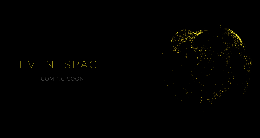
EVENTSPACE is data graphics experiment where the goal is to create a rich moving interactive frame to view geo-temporal data. At the moment, it is a browser experiment since WebGL seems like a new field to learn from and contribute to. Available to experience as an interactive dynamically-generated movie, or as a more direct interactive visualization, EVENTSPACE is trying to make the experience as closely informed from the data as possible.
This is currently work in progress and the first version will be launched soon, using the Pantheon dataset as an example.
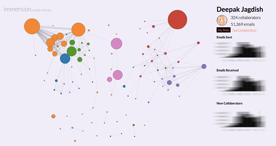
IMMERSION is a visual data experiment that delivers a fresh perspective of your email inbox. Focusing on a people-centric approach rather than the content of the emails, Immersion brings into view an important personal insight – the network of people you are connected to via email, and how it evolves over the course of many years.
Immersion looks at only the email-metadata (From, To, Cc and Timestamp), and never at the Subject or body content of any emails. This project was implemented using d3.js and Tornado in collaboration with a fellow graduate student (both of us are from the Macro Connections group at the MIT Media Lab). Given that I worked on many different layers of this project -- conception to production; front-end to back-end --, it taught me a lot of valuable lessons.
Try out Immersion for yourself!
Or, watch the video: Immersion: Beneath the surface
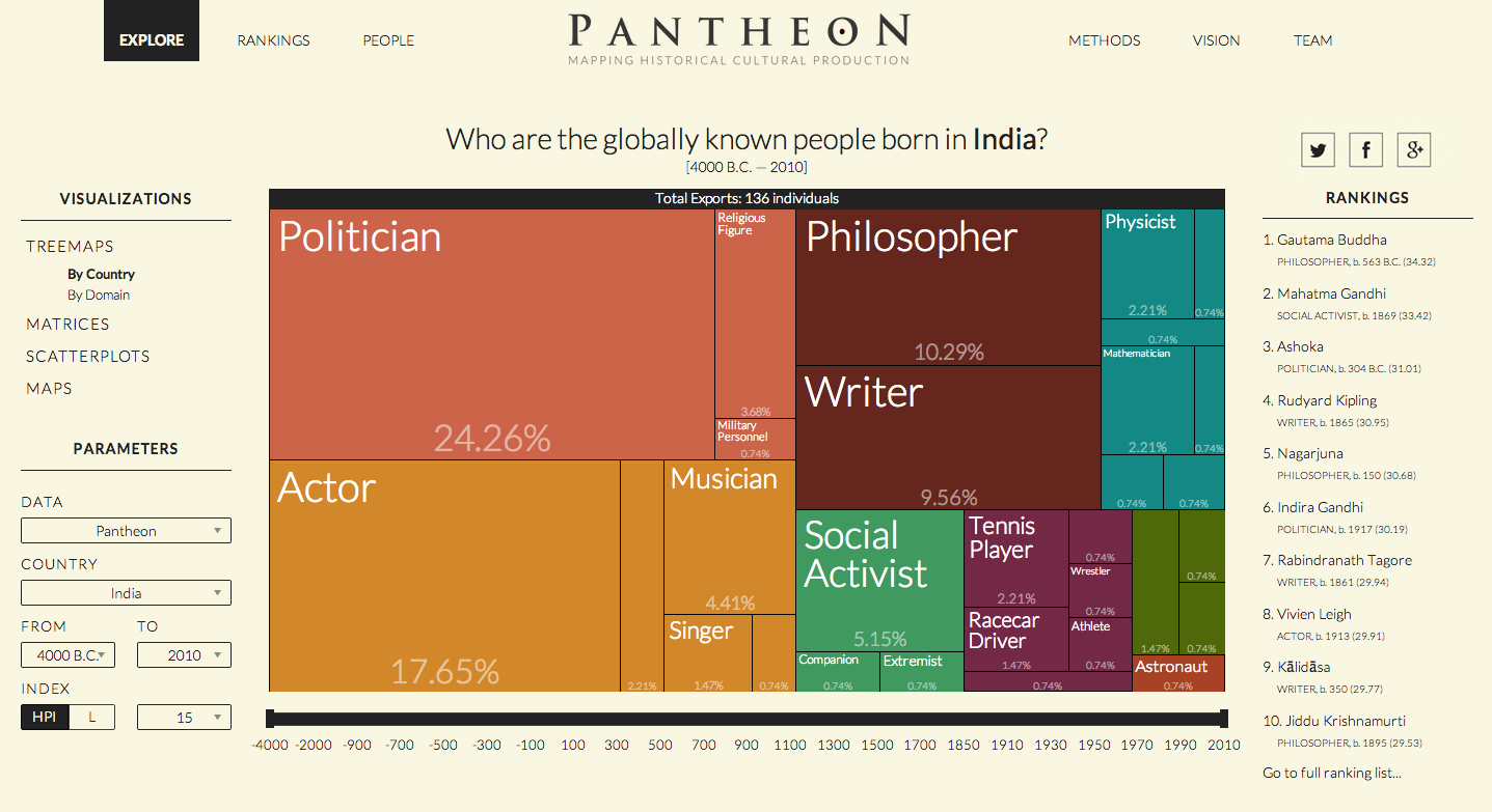
PANTHEON is a project that aims to quantify, analyze, measure and visualize global culture. By using significant individuals from each country as a proxy for its cultural production across many centuries, Pantheon pulls together a cohesive, scientific approach to visualizing data on historical cultural popularity and production. After the (exhausting) data collection and curation which gave rise to a very rich dataset, Pantheon brings that data to life using interactive visualizations powered by D3Plus (an extension to the popular D3.js library).
My role in this project included information architecture, visual design, producing the project video and a few bits of data collection.
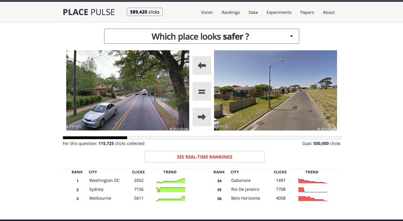
PLACE PULSE aims to quantitatively recognize which areas of a city are perceived as wealthy, modern, safe, lively, active, unique, central or family friendly. By pulling in random streetview images for 56 cities from around the world, users can then vote between two images and over time our scoring mechanism converges to reveal interesting results about each question and city.
My role in this project included extending it from its initial version (4 cities) to 56 cities, data collection and curation, server optimization, visual design and front-end development.
Check out Place Pulse and add a few votes of your own!
The following projects were crafted during my time as a Visualization Engineer + Designer at Nokia Research Center, Palo Alto, from Summer 2010 - August 2012. Portfolio of projects done prior to Summer 2010 are also linked at the end of this page.
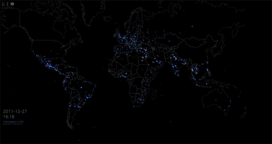
Real-time visualization of worldwide activity of any geo-tagged data stream, showing points on a city-level granularity. This project was implemented in HTML5 using a combination of canvas and svg. Geopops can being packaged as a framework for visualizing any kind of geo-spatial time-stamped data. Blue circles represent data points from the past, and they fade out over time, leaving persistent marks only on locations that are hyper-active. Orange circles (pops) are animated in to the top layer of the viz showing where the most recent activity has occurred.
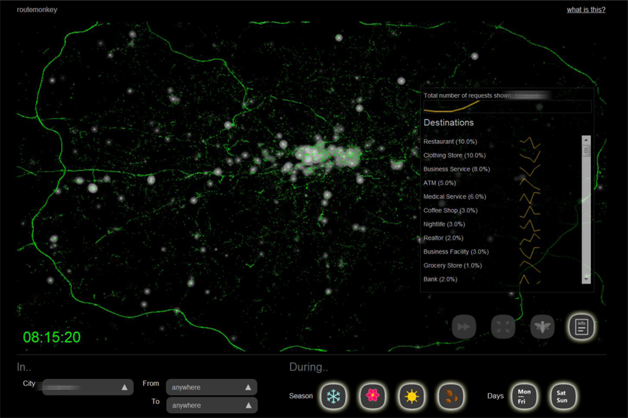
Using cumulative anonymized GPS request data from cell phones in major cities, this visualization represents how the general contour of the urban transport layer comes to assume its true form without an underlying map to support its structure. Each green dot is one request received, and the small white clouds denote a small clustering of destinations users are searching for.
Some post-processing on the data (by matching lat-lon data to actual places info) reveals the locations people travel to and from at certain times of the day. We pushed the envelope of data filtering to customize requests based on certain seasons of the year.
This visualization provided some very important feedback for the Maps team in Nokia in terms of bugs in requests made per client, and also anomalies in their place recognition algorithms. This whole project was implemented (server-side and front-end) using Javascript and HTML5. Some Python code was written for data-mining purposes.
My role in this project was primarily the design of the interface.
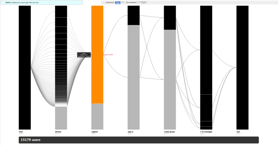
RUUTU in Finnish means _rectangle_. The goal of this experiment was to find out the flow of users’ actions for a particular app. This can be useful to find out at what point exactly did users who didn't like an app drop off, and what did the ones who continued using it do differently.
The above visualization depicts the different stages of a user’s interaction with an application – starting with Registration, then figuring out the device model, mode of registration (web/Bluetooth), Log in, Creating a messaging group, Sending / Receiving messages etc.
The transparency and weight of each curved path connecting one stage to the next reflects the number of users who took that path. By clicking on a rectangle, you can see the number of users who took that particular path involving that node.
This project (not exposed to the public) was built over a year before a similar visualization appeared in the Google Analytics dashboard.
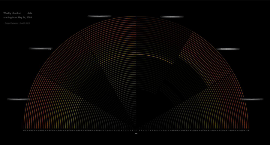
This was my first project after I joined NRC, and also my first time using Javascript and HTML5. The goal of this prototype was to compare the number of users in different services of Nokia (like Maps, Music, Store, etc.) and find out the differences in timelines where there was a wave of new users coming in, and when users dropped out.
Each section of the pie represents a particular service. Each arc represents a week (week 0 at the center, and this week count increases towards the periphery of the pie.
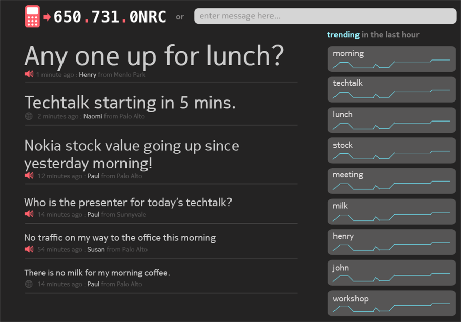
As part of a four member team, in a whirlwind couple of days of hackathon in our lab, we came up with a solution called 0-NRC. Using this service, people could call a particular phone number, and just leave a voice message, which would then get transcribed to English text on the server-side and that message would get posted to a message board visible on the large display within our office. Alternatively, users could also visit the website directly and post a message.
The main goal of this project was to push the envelope of HTML5 to the max, as is evident with our use of WebSockets and the Audio API. Location detection was also enabled, apart from quick sparklines visualization of trending topics.
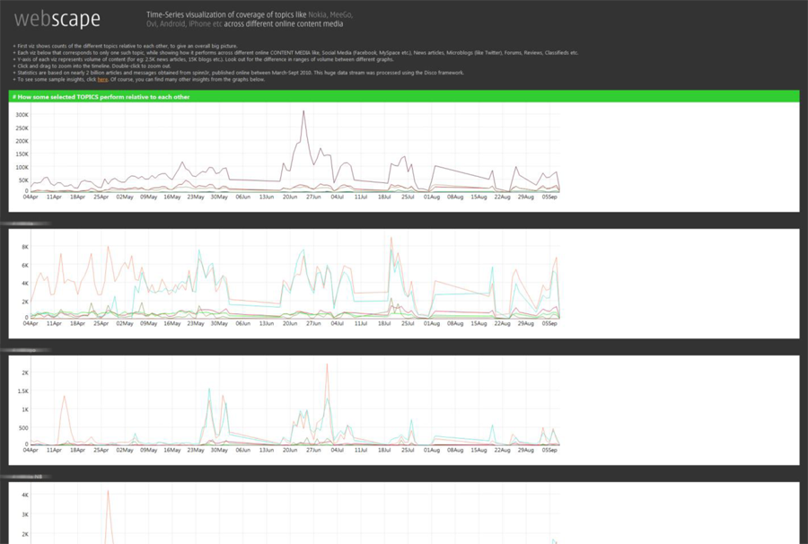
One of the most data-intensive visualizations I have worked on, WebScape utilizes NRC’s in-house Map-Reduce framework (Disco) to crunch almost 2 billion text articles on the internet (primarily the blogosphere and social networking sites) to mine for certain keywords and memes. Since we wanted to answer specific business-related questions with this, we were able to compare Nokia’s presence on the blogosphere to some of its competitors, with specific emphasis on certain products.
This is a compilation of projects I worked on during my final year of Masters in Human-Computer Interaction at Georgia Tech, Atlanta. Some of these projects stem from my interest in mapping and the arduino platform, and also includes a project done at Microsoft Research during an internship stint in the summer of 2009.
This older portfolio of projects consists of work during my formative years in fusing design with some form of engineering (mostly Computer Science). Some of these projects have won some competitions, while some others have been mere experiments in the pursuit of picking up skills with a new tool or topic. This requires Adobe Flash, and some projects’ assets might take some time to load. (sorry)
Here are a couple of my favorites from the past: (1) Mapping Crop to Cup (2) Newstack
Last updated: Jan 2015